8.15.2011

Modern, meet Traditional

Seems every where I look, design blogs and magazines are bombarded with wedding features. I figured I'd do my own twist on the topic: marrying traditional with modern. A common issue that always comes up at my internship is the difference in taste between married clients. One always loves modern design while the other opts for traditional. How do you marry the two aesthetics together in a cohesive manner?

RUGS
Recently, there has been a new trend in over-dying traditional, Turkish rugs. It takes a classic piece with traditional designs and modernizes it with bright, funky, new colors. I adore them! You can find them anywhere right now since they're such a big trend, but ABC Carpet happens to be having a sale at the moment.

ABC Color Reform


WALLPAPER
This faux wood wall covering by Nobilis is a great choice for something with both a modern and class aesthetic. It takes the idea of traditional wood wall panelling and turns it into a modern, texture-less wallpaper.


PAINT
And of course....when in doubt, paint paint paint. One of the easiest ways to add a splotch of modern to a traditional room is to paint with bright and loud colors - be it the walls or even the furniture. It's also probably the most inexpensive way too!

House Beautiful

House Beautiful


Elle Decor

8.08.2011

Manly Monday

This summer, one of the main projects we've been working on at my internship is a man's town house located on the upper east side. I've entered the project during it's more final phase - visiting the construction site to make sure everything is going along in a timely manner. There are still a few loose ends we have to purchase, but the major design stuff has already been decided. The client's aesthetic taste is very masculine, mixing traditional with industrial chic (quite a difficult mix). I've been dying to do a masculine bachelor pad design for school, but the real thing is even better. Had I been around from the beginning of the design process, here's what I would have suggested:

INSPIRATION


James Merrell

Nothing says masculine decor like a set of antlers, leather upholstery and over-sized British furniture/decor.

Todd Yoggy
A simple color palette concentrating more on texture and traditional elements such as the nail head trimming on the leather upholstered headboard and brass finished light fixtures resembling Greek columns give this bedroom a sophisticated masculine touch.

Mary McDonald
Deep, dark colors and traditional wall panelling with a modern twist, striped linens and a dashingly handsome bust. All that's missing is a huge fireplace from this man den.

Vogue Living
I love large wall decals such as this image of a roller coaster. Vintage maps and signs are an easy way of adding a masculine touch to a room. Again, notice the use of texture in this room between the wood floor planks, jade glass, distressed leather ottoman, brass lighting fixture and shiny black lacquered console/shelving unit.

MY SUGGESTIONS
Here are my suggestions for a manly decor:

Accessories. Pillows and plaid throw via Pendleton, baroque weathered mirror via Restoration Hardware,  horse head sculpture via Haus Interiors, Safety Deposit via Haus Interior, Vintage inspired scale via Restoration Hardware


Lighting. Flush mount ceiling fixture via Circa Lighting, exterior wall sconce via Interieurs, chain link cargo cluster pendant via Davey Lighting, '67 boom arm floor lamp via Ralph Lauren Home, Blackened bronze flush mount ceiling fixture via School House Electric, vase uplighter via Soane


Furniture. Trunk side table via ABC Home, tufted sofa via Ralph Lauren Home, metal armoire via Interieurs, Chinese inspired rattan cocktail table via Ralph Lauren Home, vinyl poof and leather desk chair via 1stdibs, bascule desk via Soane

8.03.2011

Luxury Furnishings

Since my internship began, I've been introduced to something I've never had to face before in school: a budget! It's pretty crazy to think that when I'm browsing online for furniture and fabrics, they're actually going to be bought and placed in a real person's home. Now instead of things just looking right and following a school project concept, I have other things to consider such as price, comfort and dimensions that fit appropriately to each client.

I've discovered a whole new set of vendors that are much more luxurious and traditional than I am used to in my more modern school projects. One of these vendors is the notorious George Smith. I am officially obsessed with his seating. The next sofa I purchase WILL BE a George Smith sofa.

George Smith sofas come in a variety of designs often mimicking Neoclassical pieces. 

Such a traditional piece, upholstered in the right fabric can make these sofas fit any type of decor. They look great in any modern, transitional and/or traditional space. 

What makes a George Smith piece more expensive and more luxurious than the rest? It's all about the stuffing. Most standard sofa cushions are stuffed with a foam core and then wrapped with some duck down to give it softness. These sofas are pure duck down and feather. It is HEAVEN to sit on. The downside? It's a pain in the butt to have to fluff constantly unless you are going for a rustic, eclectic look in your room.


Every George Smith sofa is hand built and can be 100% customized - even down to the castors. As much as I adore the kilim upholstery, I suggest you only upholster an ottoman in this fabric because it is very itchy on the skin.


Ok, so it may be a longgg ways away before I can afford my very own George Smith sofa, but some day...some day!


7.29.2011

I'm Back!


Dear Blogettes,

Another semester is done! Now, back to posting...

For the past two months I have been designing a hotel lobby and executive penthouse suite in Singapore with a partner for school (post to come). But besides that,  I landed myself a summer internship with a small residential firm located in Chelsea. I've been having a blast and learning a ton of things they just can't teach you in school. Make believe projects are nothing like real clients and real budgets. Through my daily shopping research for work, I've come across all sorts of cools things I've been meaning to share. So here's to joining me on my new professional journey! Three cheers!

-E

5.27.2011

First beach day of the season!

Ahhhhh life is good. Just came back from Rockaway Beach where I sunbathed, read and drank iced pineapple mint juice. Inspired by my Memorial Day weekend kickoff, I thought I'd post a few fun summer furniture pieces and home accessories.

Aboubakar Fofana at Amaridian
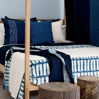
  • I found out about Amaridian, a NY gallery representing contemporary African artists, when I was researching for my South African law firm project. Although these bed linens weren't appropriate for a law firm, I say it's time to put away the goose down comforters and whip out the light summer quilts. These colors are so refreshing and soothing and just scream a restful sleep.


  • I think my favorite thing about summer housewares are the fun, energizing colors used. Citrons, aquas, and grapefruit pinks just give everything a more playful feel. Anthropologie knows exactly what I'm talking about.


Springbok Benches

Tord Boontje Shadowy Chair

  • Outdoor furniture, the essence of summer interior decorating. Anamorphic and biomorphic furniture design is nothing new, but it doesn't mean I don't still love it. There is something so fitting to me of the idea of furniture living in the outdoors and replicating the animals that live out there too.
Vintage fretwork daybed
Beehive by Extremis at Nova Studio
  • And lastly, for those with a significantly larger outdoor area we have the gazebos and outdoor daybeds. Outdoor luxury at its finest!

Happy Memorial Day weekend everyone!

5.25.2011

ICFF

This summer break I attended the ICFF ( International Contemporary Furniture Fair) aka Designer Heaven. It was great to see some of the new and upcoming things the design world has to offer. It gave me some great ideas to implement in future projects. Here are some of the trends I noticed for 2011.

Cloud Lights
These guys were everywhere. Some were more literal translations of a cloud, some less so.

Cloud Soft Light by Molo Design


Mamacloud by Frank O. Gehry

With all those clouds light, you'll probably need at least one of these Steven Haulenbeek cumulus light canopies

Reclaimed, Salvaged Materials
This isn't so much a new trend as a continuing and expanding one. With green design becoming more of an ethos than an option in interior design, reclaimed and salvaged materials were a plenty at this year's ICFF.


I took  a big liking to Palo Samko
 
Stagg by Hooker&Co


Cluster Pendants
It also seemed every time you looked up, you were surprised with one of these guys; pendant lighting with clusters of light sources. The new modern chandelier??


Knotty Bubbles by Lindsey Adelman

Grain Design's Iacoli & McAllister Large Frame Light Cluster
Roll & Hill's Modo Chandelier

5.24.2011

Pin This


A friend recently got me hooked on this new website, Pinterest and I just had to share it with all of you. It's right up my alley and for anyone else who loves trolling through blogs and making to do lists.

"What is Pinterest?
Think of Pinterest as a virtual pinboard — a place where you can create collections of things you love and "follow" collections created by people with great taste.
People use Pinterest to collect and share all sorts of things -- wedding inspiration, favorite T-shirts, DJ equipment. You name it, people are pinning it.
We know you have great taste in something. Our mission is to make Pinterest the best place for you to share your taste with the world."

You have to request an invite which usually takes about a day. But it's worth the wait. Once your invite is approved, they give you button to place on your toolbar and after that, anytime you see something online that you love, you click your Pin It button and it attaches the image to one of your pinboards. I'll definitely be using this site to pin things that I'll want to post about later. In fact, now you can watch my pinings if you click on my new button to the right.

Happy Pining!

DIY

Finally with some down time, my roommate and I got the chance to do a few do-it-yourself jobs around the house. I think what really motivated us to get it all done was after my roommate came back from the Brimfield Antique Show in Massachusetts with a real PERSIAN RUG!

Even Lily loves the rug

With this new addition to the living room, we could finally start to make the room more cohesive buy choosing a color scheme. The rug is huge and takes up almost the entire room so it became the main decider in our color options. The blue-green rug against our yellow-orange stained wood floors was a blessing ( color compliments!). But I wanted more than just blue and orange...so we went with a color triad (blue-green, yellow-orange and red-violet).

We painted the bookshelf nook Misty Harbor. This color came from the lighter blue found in the rug.
We re-stuffed our once dying mid century modern armchair with some new foam and had custom pillows made in this magenta fabric from Ikea. Notice the wood of the armchair is also in the yellow-orange family.

I secretly sanded and painted this side console in a pewter metallic paint. I knew my roommate wouldn't believe me that it would look great until she saw it done. Previously, there were too many different kinds and shades of woods in the room and every room needs a little shine. The candles at night give the room a great ambiance but at times feel a bit like a seance. 

My roommate also bought this cute little milk maid seat. I'm still trying to convince her to put it in the living room and not her bedroom.
The next step in this room transformation? Probably the most important thing...lighting! Stay tuned..

Summer Break!


Ok, ok, ok. I have been gone far too long...but it's summer break!! I came across this saved draft of my summer to do list and realized that with two weeks left of my break before the summer school session begins, I should probably post it as well as much more. This is what a young, bushy-eyed hopeful Emma had in mind just three weeks ago.....

Summer Reading List. Now that I'm not reading code books and researching at InformeDesign, I finally have some downtime to do some reading for myself. A few to note:

She's Come Undone
Under the Banner of Heaven: A Story of Violent Faith
Stiff
Packing for Mars
I Know This Much is True


* Present day Emma has not accomplished this yet


De-Stress and Exercise. That's right, I'm going to actually use my gym membership. I'm also going to finally fire up all the lavender candles and incense my mother has bought me to help alleviate stress. And sunlight! I think I might actually see sunlight this break!! To top it all off, I might go to the New York Spa Castle in Queens with my friends, something we've all talked about for years now. Check it out here.


* Present day Emma has attempted this (the gym part atleast).


More Blogging. I'd say this one is pretty self explanatory. With school not in session I finally have the time to LOOK at design. I have lots of design shows to attend and magazines to read and lots of blogging in store to discuss it all.


 * Present day Emma WILL rememdy this one.


DIY Projects. I really feel that an interior design student's home should reflect her expensive and time consuming schooling. This summer I vow to do those do-it-yourself house projects that never get actually done. Re-arranging furniture, painting furniture, re-foaming an armchair, and lots of shopping for home decor!


*Present day Emma HAS accomplished most of these, with the help of her roommate. More on that in future posts!


Images from top to bottom via: Transcience, House Beautiful, Corebloggers, Brooker Pie

5.16.2011

NYSID Kitchen of the Future

One of our last projects this semester in our kitchen & bath course was a group collaboration in which we had to come up with some discussion points on what the kitchen of the future might look like and blog about it. My participation in this project was as co- project manager. Here's our finished product also available on our school website:

Kitchen of the Future

5.09.2011

Happy Mother's Day


In honor of mothers day this past weekend, I thought it would be fun to look at the works of a few mother-daughter interior design duos that are out there. Check out the Atlanta Homes & Lifestyle article here.

5.04.2011

Last Studio Project of the Semester!!

Our last studio project this semester was to design the children's room of the Chappaqua Public Library. I based my design off of the famous children's book, Harold and the Purple Crayon by Crockett Johnson.

Harold and the Purple Crayon is the story of a four-year boy named Harold who possesses a magical crayon that allows anything he draws to come to life. Harold soon finds himself stuck in an adventure drawn by his own crayon and realizes the only way he can get back home is if he can draw his bedroom window where it all began. With the use of Harold’s purple crayon, the Chappaqua Library’s Children’s Room aims to aid children in the development of their cognitive skills by providing easily readable wayfinding tools while also providing a comfortable and nurturing learning environment. At the Chappaqua Library, all children are welcome to find their own window.


Goals & Factors of the children's Chappaqua Library Design:

  • To facilitate exploration by supplying circulation paths and sight lines

  • To create a homogeneous space for children five and under so that they can more easily use categorical information to organize the area, such as spatial boundaries
  • Children ages 6-8 scan vertically when wayfinding while children ages 8-12+ are capable of scanning horizontally
  • Color aids wayfinding for young children
  • Children prefer semi-enclosed, small spaces which fulfill their need for both seclusion and exploration


Conceptual Model
Floorplan.
You will notice a purple line flowing through the floorplan. This purple line guides children through the entire library from the moment they walk in. The line does not always remain a line on the floor (as you will see in drawings and renderings further below), at times it becomes table legs, lights and reveals within the librarian's circulation desk, neon floating fluorescent lighting, power strips on the computer workstations and even windows within bookcases.

The space has also been divided by age groups; children ages 0 - 2nd grade are in one area and children grades 3rd - 5th are in another. The custom seating I have provided mimic some of the shapes seen in Harold and the Purple Crayon, namely the moon that followed Harold in every step of his adventure.


Sections.

Here in section, you will see the older kid's seating area, a bit of the avenue of computer workstations and a small glance at the younger children's seating area in front of the glass facing the courtyard (designed in order quite the louder children). You will noticed the middle window of the courtyard is in purple. This is where the purple line ends. It travels through a series of custom bookcases with purple windows cut out and ends at the biggest window of them all ( as seen in sketch in beginning summary). This big final window represents Harold's window that he finally finds once again.


 Renderings.

Entrance into Library

Computer Workstations
Big Kid's Seating Area (walls of the custom seating are actually white board walls so that kid's can write and draw their own adventures just like Harold. Younger kids also receive these writable wall seating areas, but their walls do not reach the ceiling. They are given less privacy due to safety issues.)
Furniture. Materials. Finishes.

Knoll graphic ink collection wallpaper and Kravet ultrasuede eco-green fabrics

Panton chairs for computer workstations and work tables

Seating for adults in young children's section

Additional soft seating for younger children.